Bar Race Chart Tutorial
Bar Race Chart: Global GDP Over Time
We’ll be creating a Bar Race Chart to visualize how the GDP of different countries has changed over time.
Step 1: Create a Bar Chart Race
- Open Flourish and under the template section, click on Bar Race Chart.
Step 2: Collect and Prepare Data
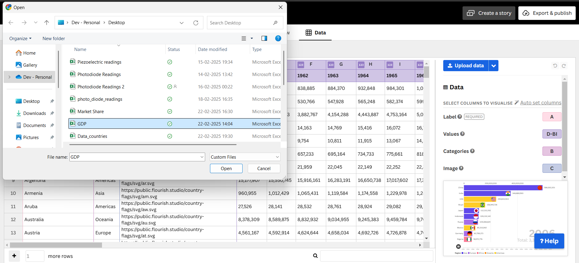
- Download the dataset containing GDP (in Billion USD) over multiple years. - Upload your cleaned dataset.
- Ensure that it has columns for Country, Year, and GDP Value.
- Clean and format the data if necessary.
Step 3: Configure the Data

- Set Country as the category.
- Set Year as the time variable.
- Set GDP Value as the numerical field.
- Adjust the speed and duration of the animation.
Step 4: Customize Appearance
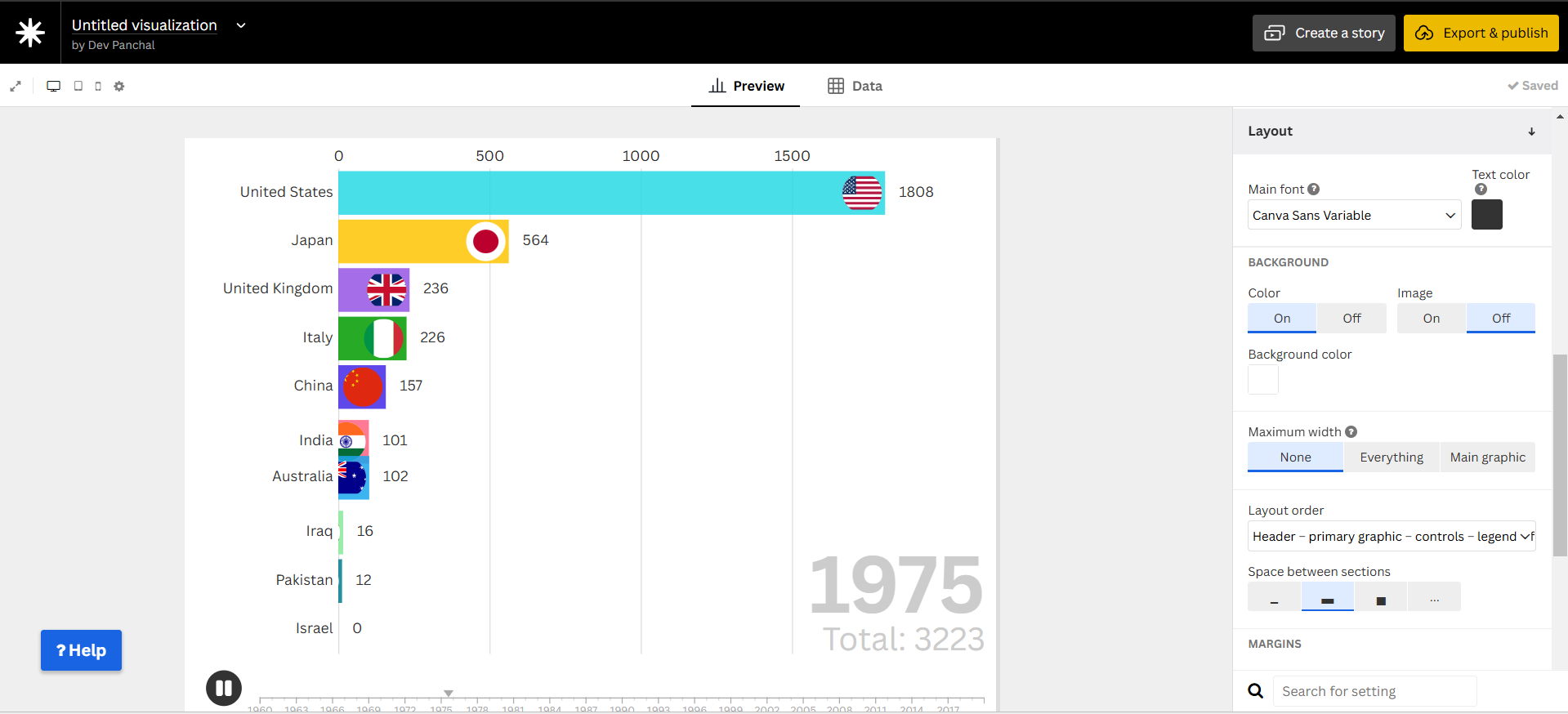
- Choose a color scheme to differentiate countries.
- Enable labels and tooltips for better clarity.
- Adjust the font size, title, and axis settings.
Step 5: Publish and Embed
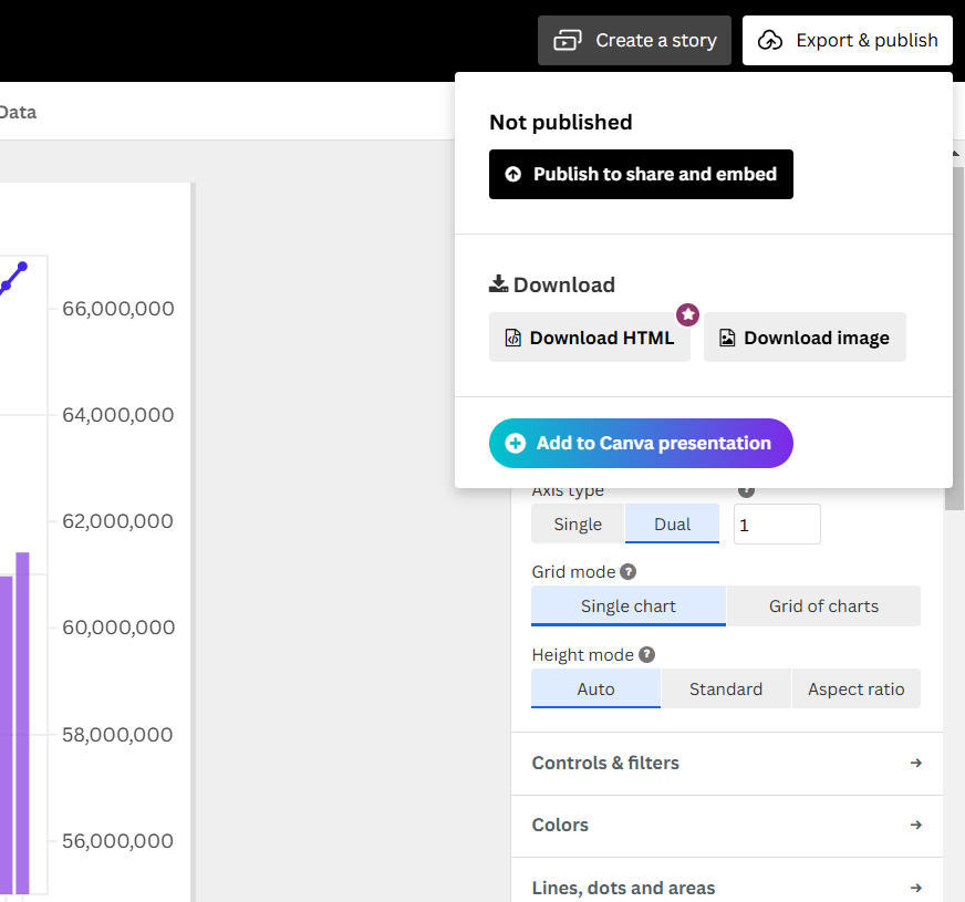
- Click Publish & Export in Flourish.
- Copy the Embed URL.
Final Bar Race Chart
Why Use a Bar Race Chart for GDP?
A Bar Race Chart is the best choice for this dataset because:
- It shows dynamic changes in GDP rankings over time.
- Highlights global economic trends in an engaging way.
- Animation helps track how countries rise or fall in economic power.
- Makes it easy to compare GDP values year by year.
You’re done! Your animated bar race chart is ready to be shared.