Grouped Column Chart Tutorial
Grouped Column Chart Tutorial
Learn how to create a Grouped Column Chart using Flourish.
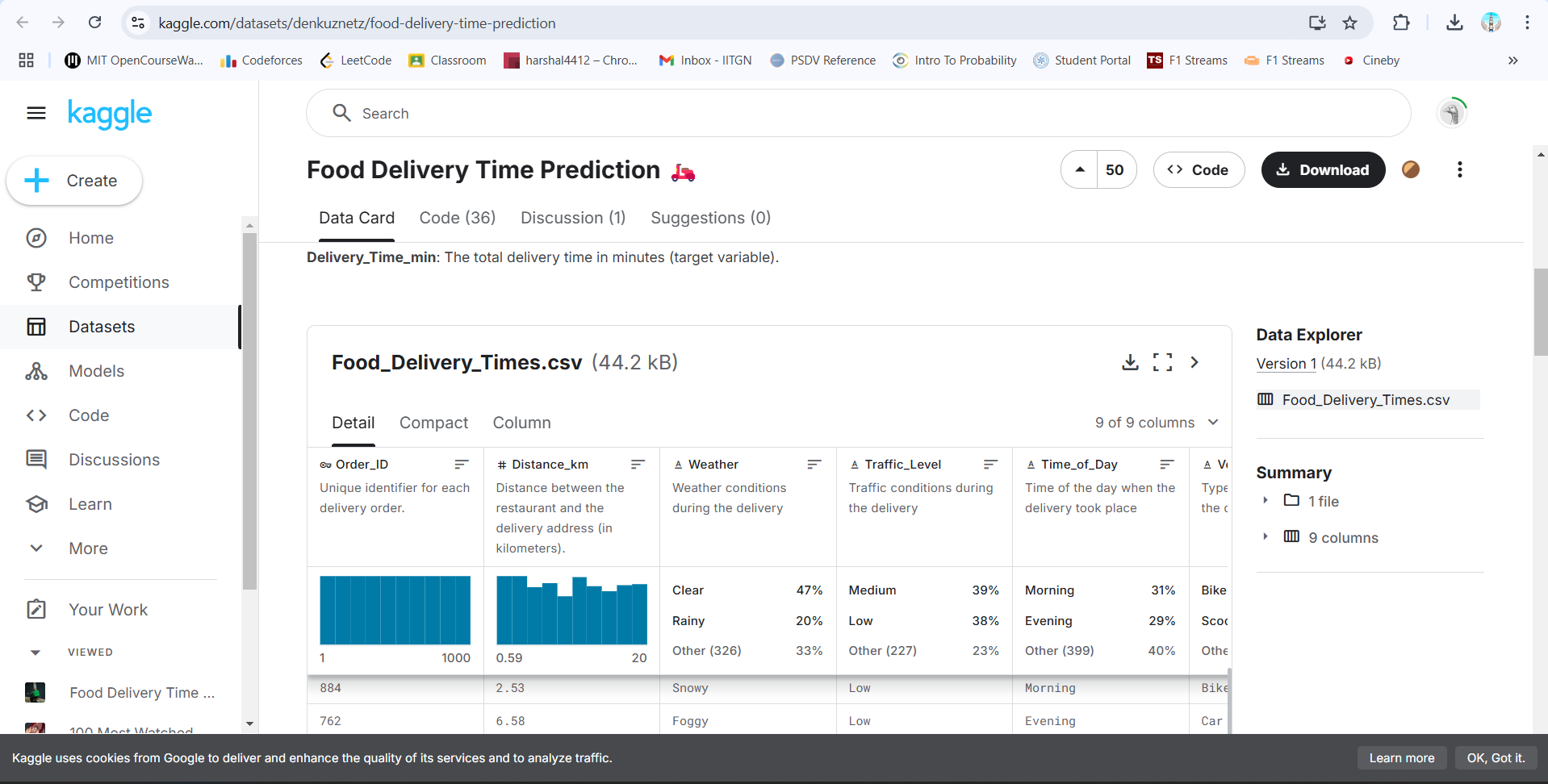
Dataset Used
We are using the Food Delivery Time Prediction dataset, which contains order time, distance, and delivery duration.
Step 1: Import the Dataset
Download the dataset from
Kaggle.
Step 2: Open Flourish & Upload Data
- Go to Flourish.
- Click “New visualization” → Choose Column Chart
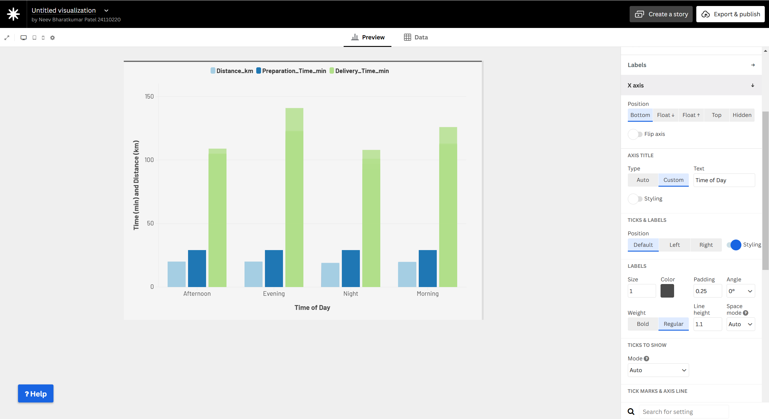
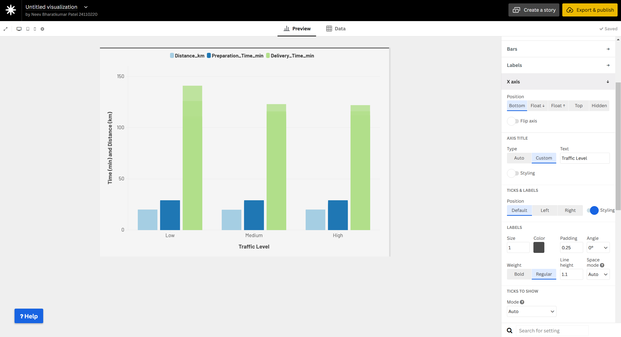
Step 3: Configure Axes & Groups
- X-axis →
Time of Day
- Y-axis →
Time&Distance
- Group by →
Delivery Type

Step 4: Customize the Chart
- Adjust colors, labels, and grid lines for better readability.
Step 5: Publish & Share
- Click “Export & Publish”.
- Embed the chart on your website.
Why Use a Grouped Column Chart?
- Compares multiple variables like time and distance in deliveries.
- Helps analyze patterns by time of day for delivery efficiency.