Line Chart Tutorial
Google Stock Price Line Chart (2020-2024)
Learn how to create a Line Chart to visualize Google’s stock price trends from 2020 to 2024.
Step 1: Get the Data
- Download historical stock data from:
- Ensure the dataset contains Date and Stock Price and Close columns.
Step 2: Upload Data to Flourish
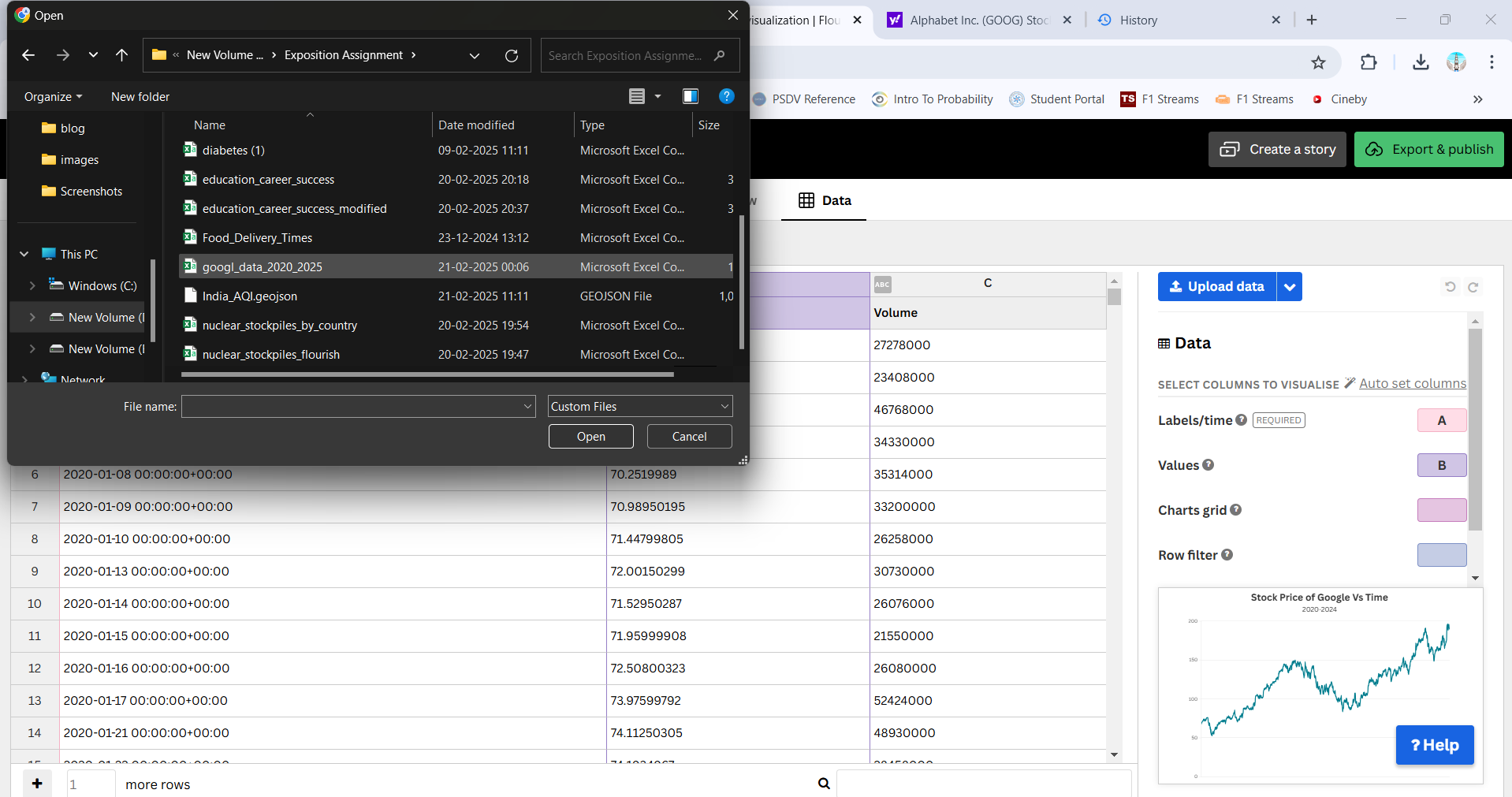
- Open Flourish.
- Click “New Visualization” and choose Line Chart.
- Upload the dataset.
Step 3: Configure the Chart
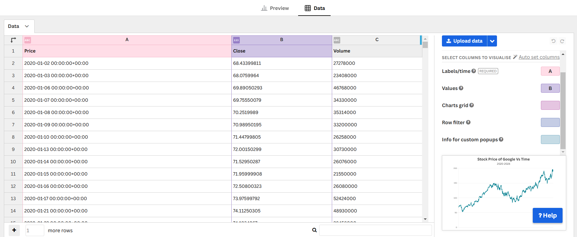
- X-axis →
Date - Y-axis →
Close - Enable tooltips for interactive insights.
Step 4: Customize the Chart
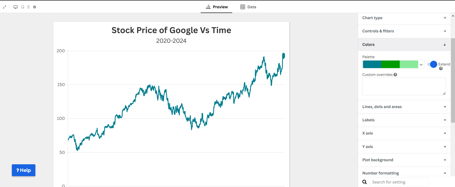
- Adjust colors for clarity.
- Enable gridlines and labels.
- Add a title and description.
Step 5: Publish & Embed
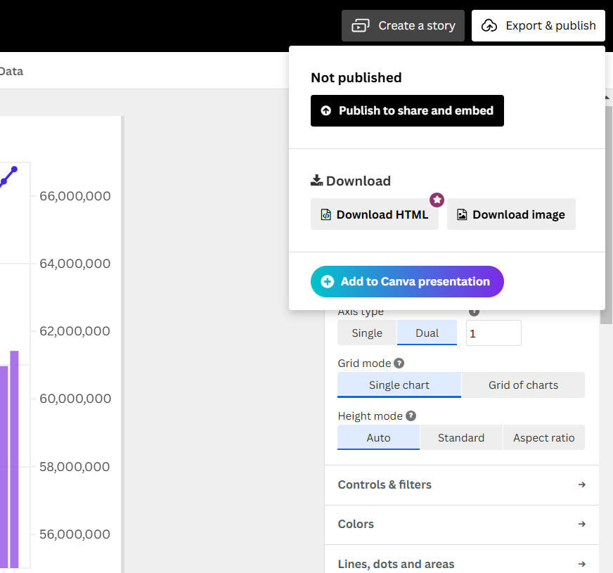
- Click “Publish & Export”.
- Copy the embed code to share.
Final Visualization
Why Use a Line Chart?
- Clearly illustrates trends over time.
- Allows comparison of price fluctuations.
- Helps identify patterns in market movements.
- Provides a simple yet powerful financial visualization.