Map Visualization Tutorial
Map Visualization: SO₂ Concentrations in India
We’ll be creating a Map Visualization to represent SO₂ levels across different locations in India.
Step 1: Upload Data to Flourish
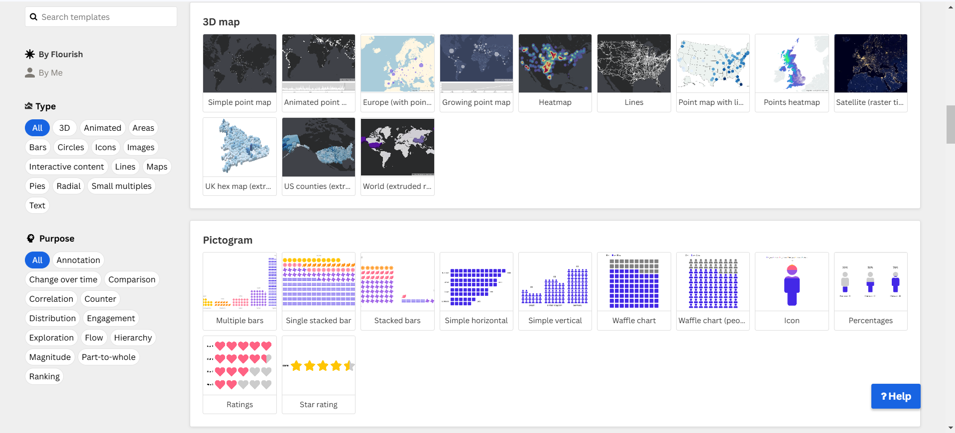
- Open Flourish and select 3D Map > Heat Map.
- Upload your dataset.
Step 2: Prepare the Data
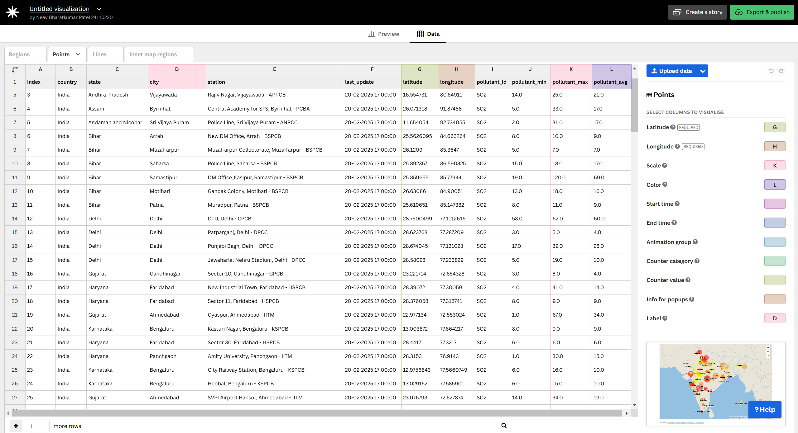
- Load the dataset and extract relevant columns:
- Latitude
- Longitude
- SO₂ Concentration (µg/m³)
- Ensure the data is cleaned and formatted correctly.
Step 3: Configure the Data
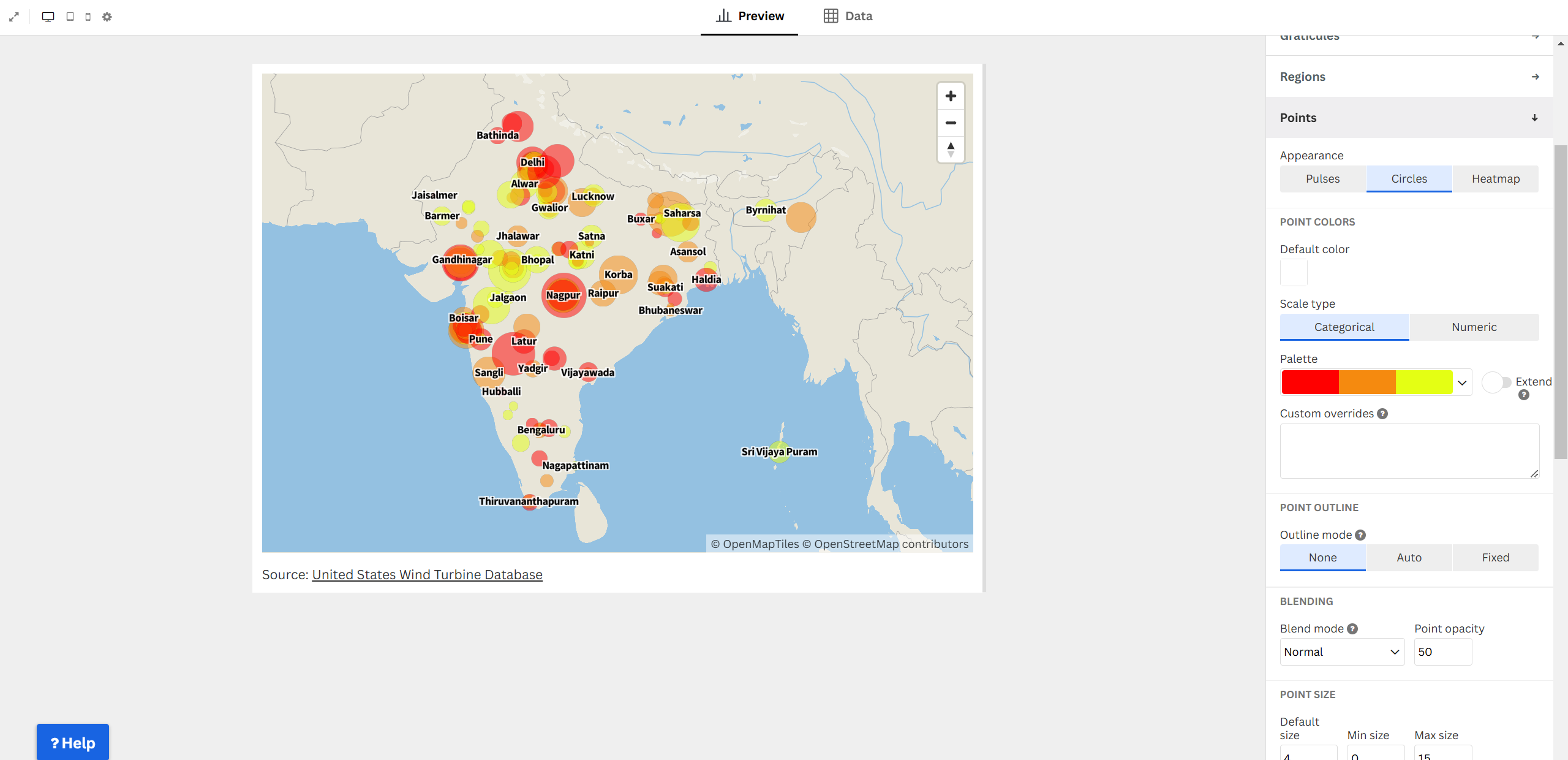
- In the points section, set the ‘Appearance’ as points.
- Set Latitude and Longitude as location points.
- Set SO₂ Concentration as the circle size to represent pollution levels.
- Choose a color scale to indicate severity (e.g., yellow for low, red for high).
Step 4: Customize Appearance
- Adjust circle opacity, size scaling, and tooltips for clarity.
- Add a legend to show the pollution scale.
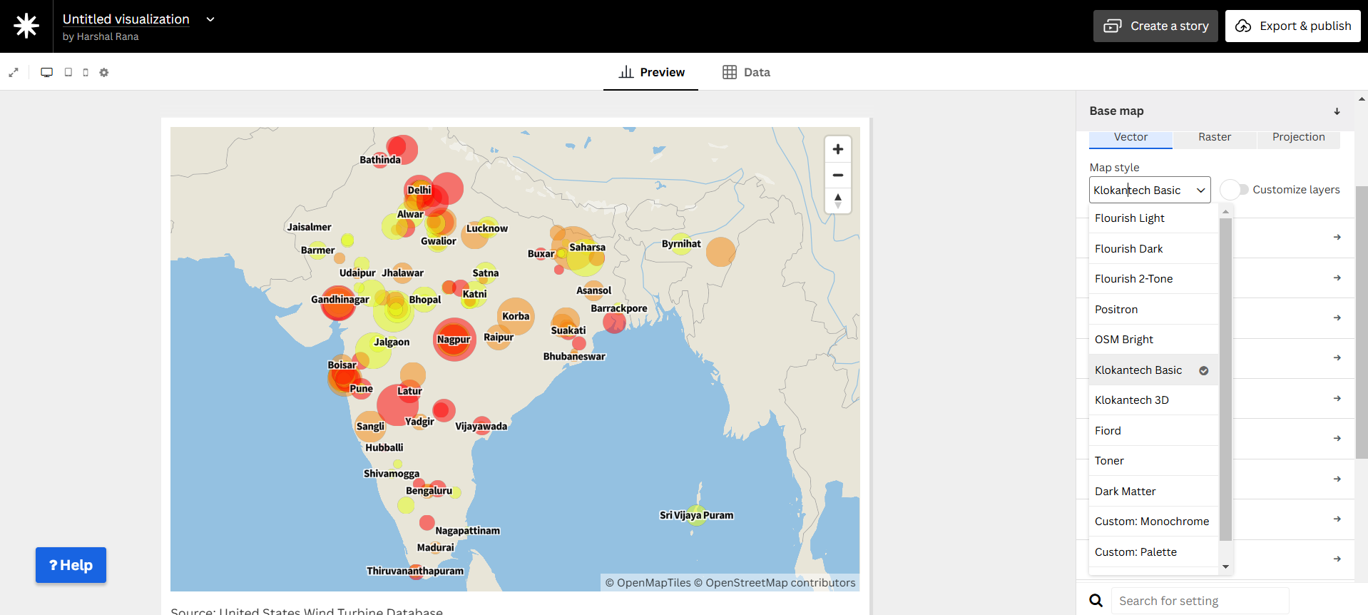
- Set an appropriate base map style.
Step 5: Publish and Embed
- Click “Publish & Export” in Flourish.
- Copy the Embed URL.
Final Circle Map
Why Use a Circle Map for SO₂ Concentrations?
- Represents pollution hotspots geographically.
- Clear size scaling shows pollution severity at each location.
- Provides a spatial understanding of SO₂ distribution across India.
- Makes trends in urban vs rural pollution more visible.