Pictograph Tutorial
Pictograph Tutorial
We’ll be using a BMI dataset from Harshal’s high school project on Obesity for the National Children’s Science Congress 2019-20. Follow these steps to create a pictograph comparing BMI categories and the number of people.
Step 1: Upload Your Data
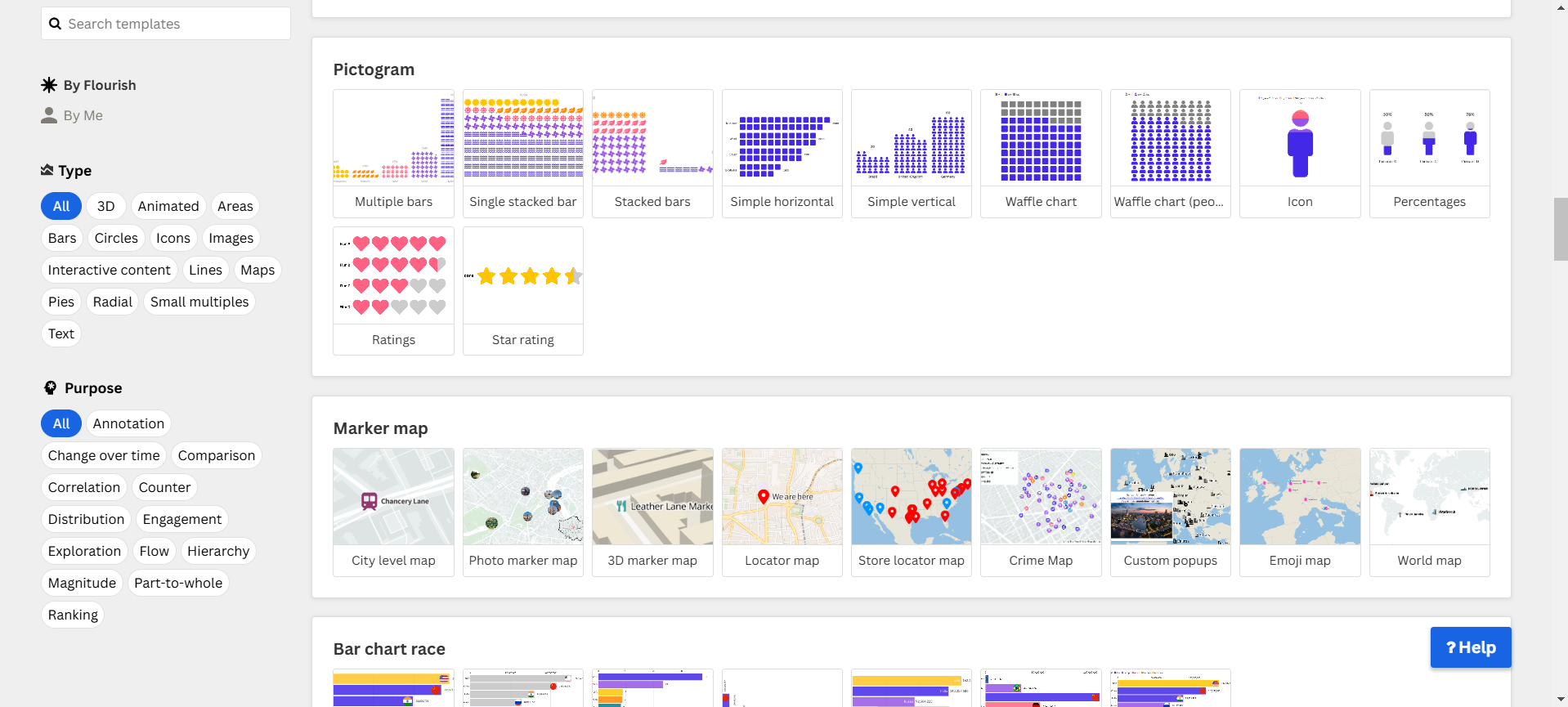
- Open Flourish and select Pictogram Chart.
- Upload your dataset (Excel or CSV format).
- Ensure that the relevant columns (BMI Category and Number of People) are correctly selected.
Step 2: Configure the Icons
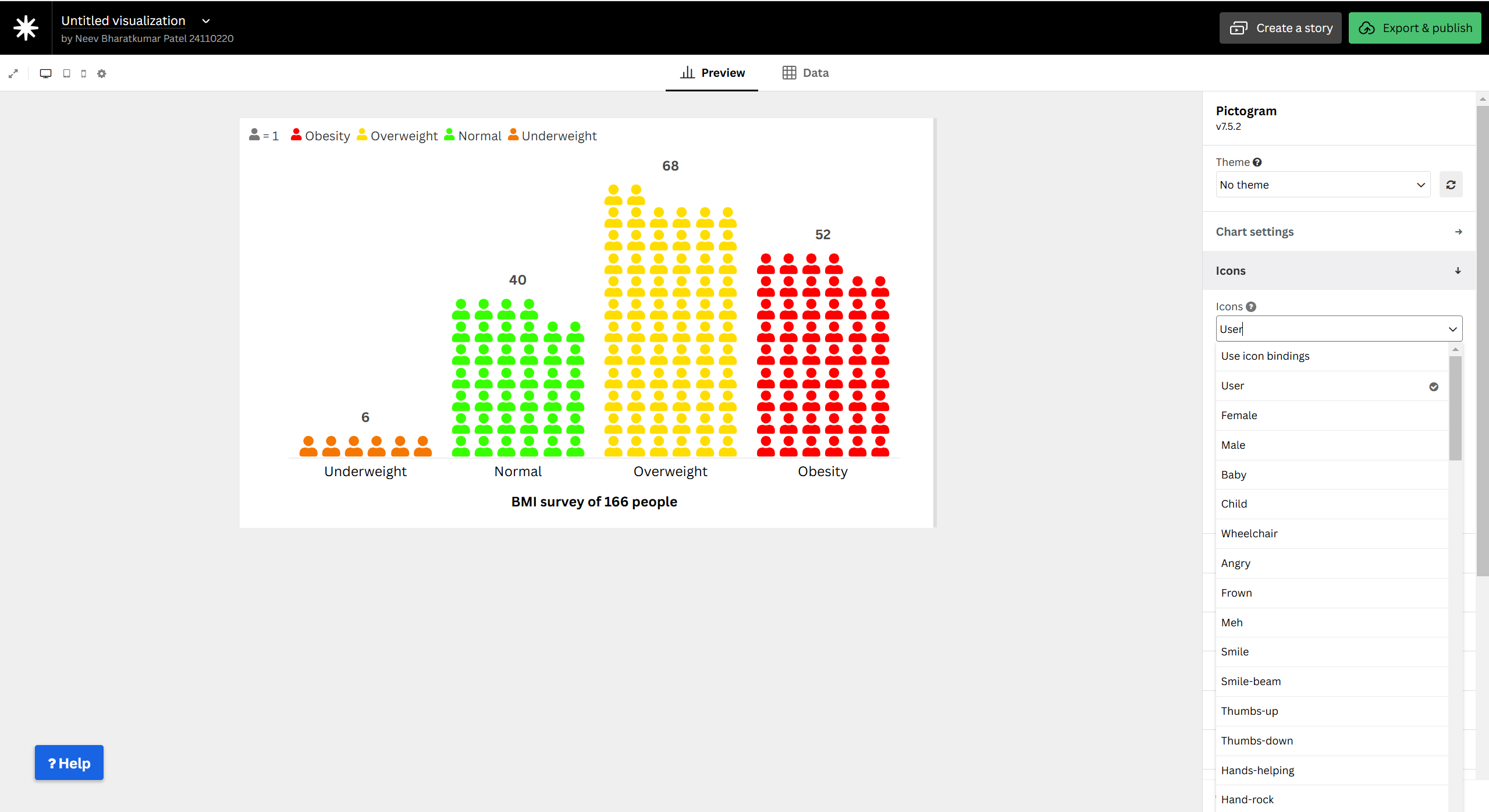
- Choose an appropriate icon to represent each unit (e.g., person silhouette).
- Adjust the size, spacing, and arrangement of the icons.
Step 3: Map the Data
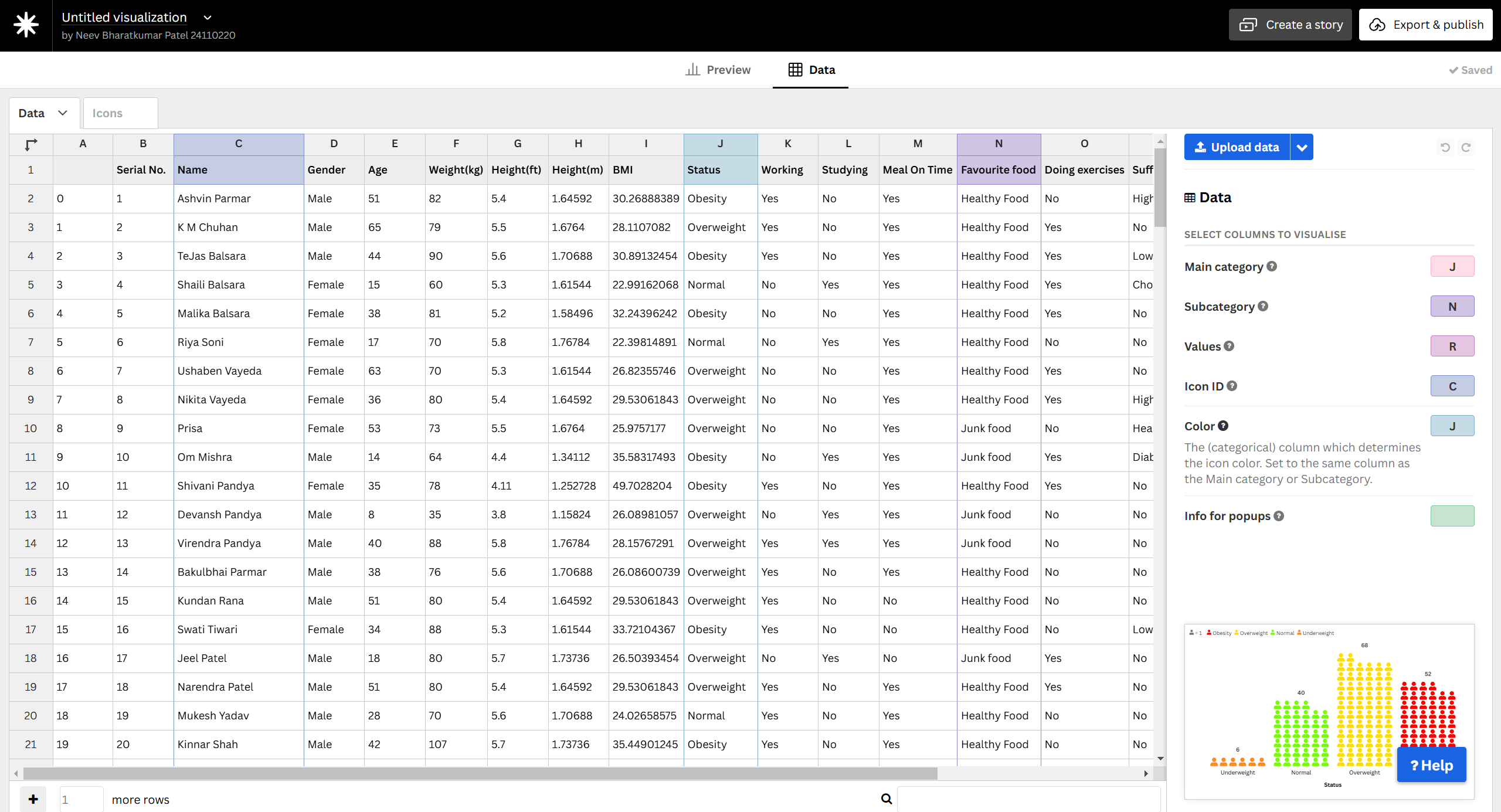
- Assign BMI categories to labels.
- Set Number of People as the value determining icon count.
- Ensure the mapping accurately reflects the dataset.
Step 4: Customize the Appearance
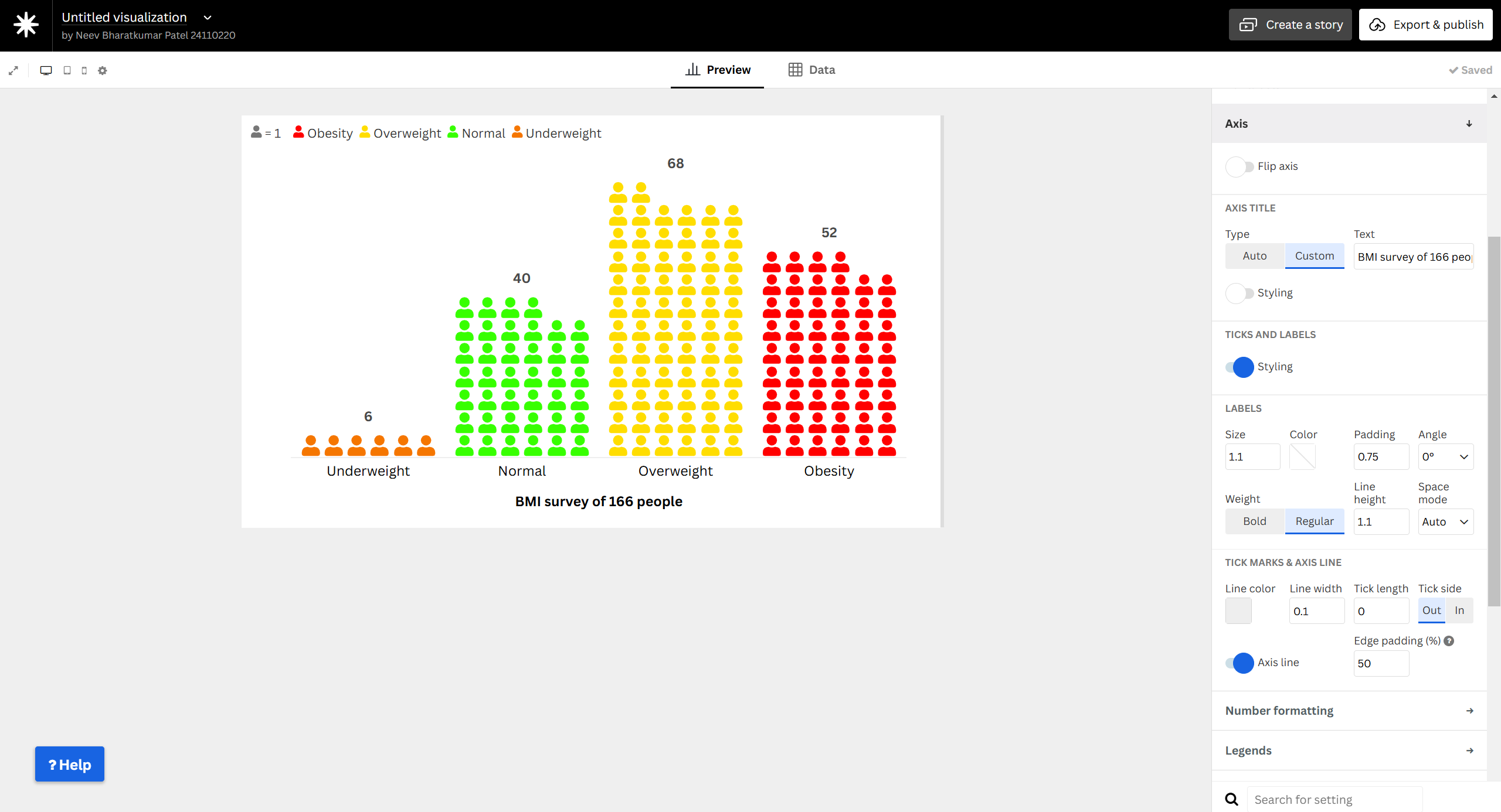
- Adjust colors, labels, and tooltip settings for clarity.
- Choose a consistent color scheme for different BMI categories.
- Ensure the chart is visually intuitive and accessible.
Step 5: Finalize and Publish
- Review your visualization for accuracy.
- Click Publish & Export in Flourish.
- Copy and share the Embed URL.
Final Pictograph
Why Use a Pictograph for BMI Data?
A Pictograph is ideal for BMI data because:
- It visually represents different BMI categories (Underweight, Normal, Overweight, Obese).
- Each symbol corresponds to a fixed number of individuals, making data interpretation easier.
- It allows for quick comparisons between different BMI groups.
- Works best for datasets where values represent grouped counts rather than percentages.
Your pictograph is now ready to be shared! 🚀