Pie Chart: Market Share of Smartphone Vendors
Pie Chart: Market Share of Smartphone Vendors
Learn how to create a Pie Chart to visualize the market share of different smartphone vendors over time.
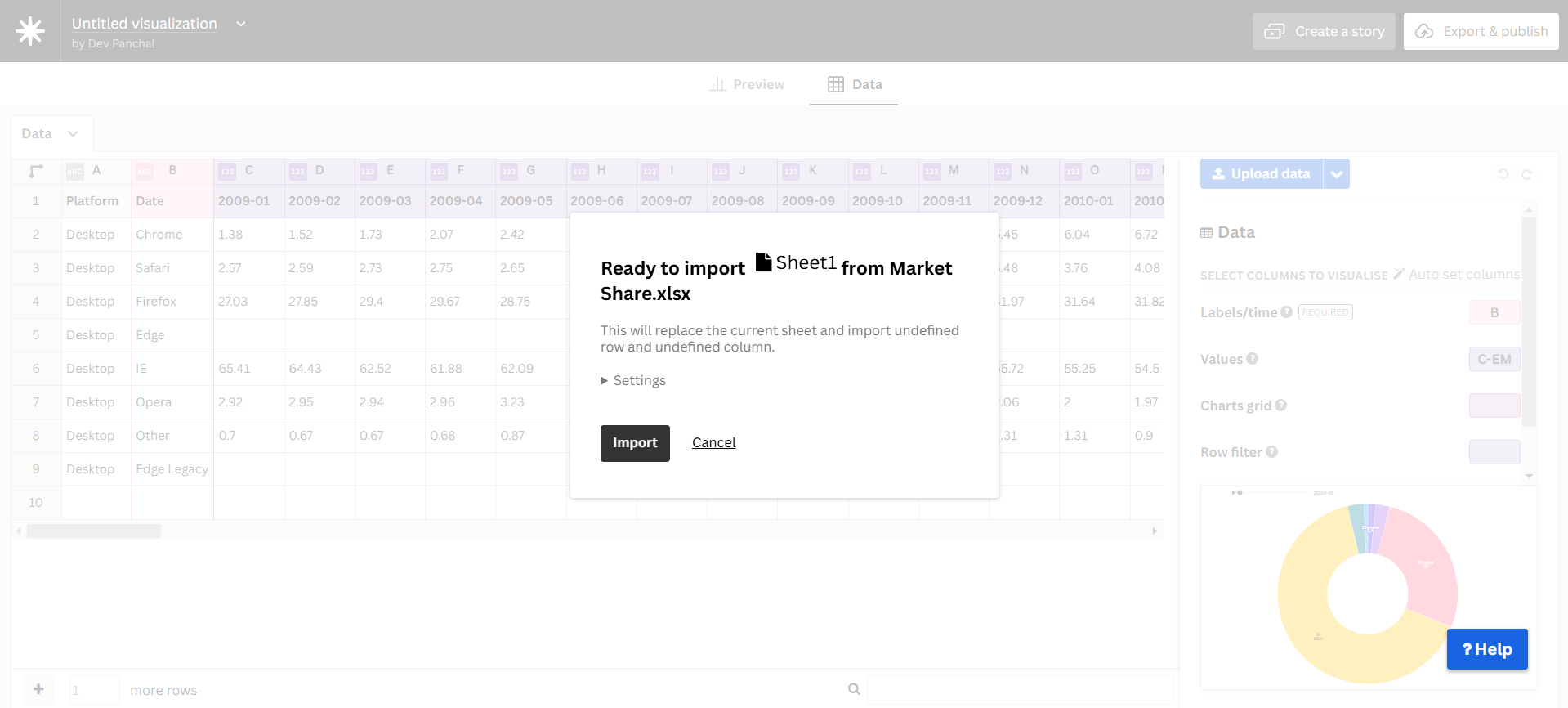
Step 1: Import Data
- Download the dataset from reliable open sources.
- Ensure the dataset includes Vendors, Market Share (%), and Year.
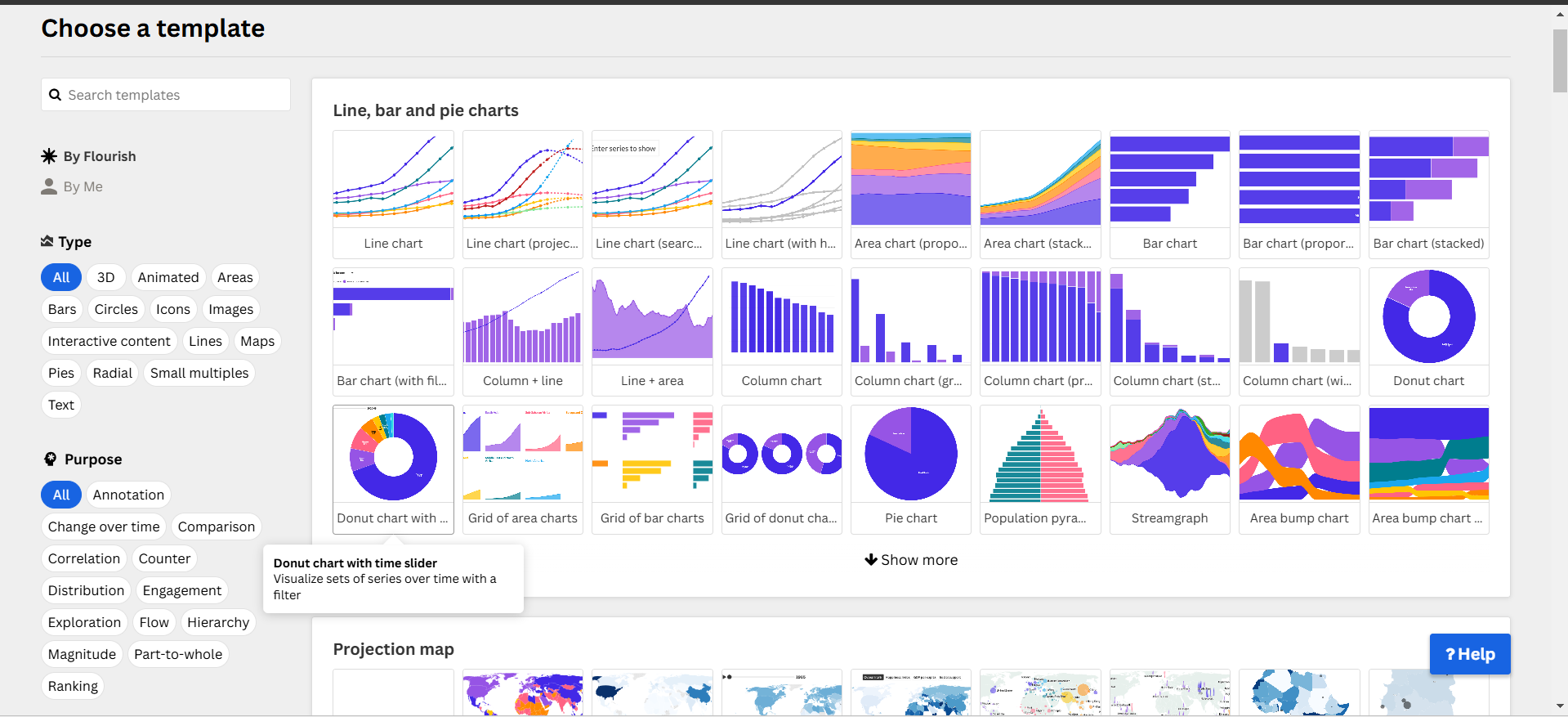
Step 2: Upload Data to Flourish
- Open Flourish.
- Click “New Visualization” and choose Pie Chart.
- Upload the cleaned dataset.
Step 3: Configure the Chart
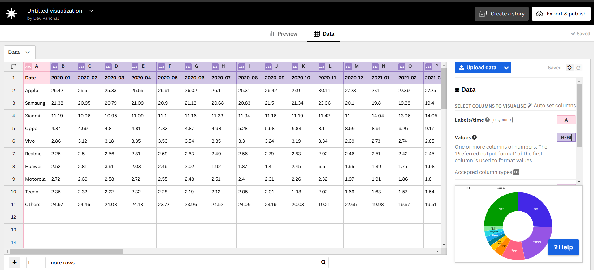
- Labels →
Vendors - Values →
Market Share (%) - Filters → Enable
Yearas a dropdown or slider.
Step 4: Customize Design
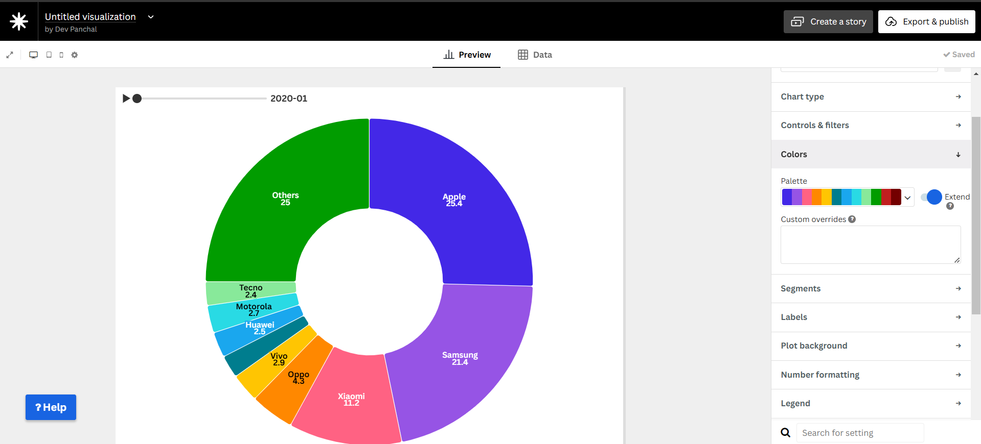
- Adjust colors for better clarity.
- Enable percentage labels for readability.
- Add a title and description.
Step 5: Publish & Embed
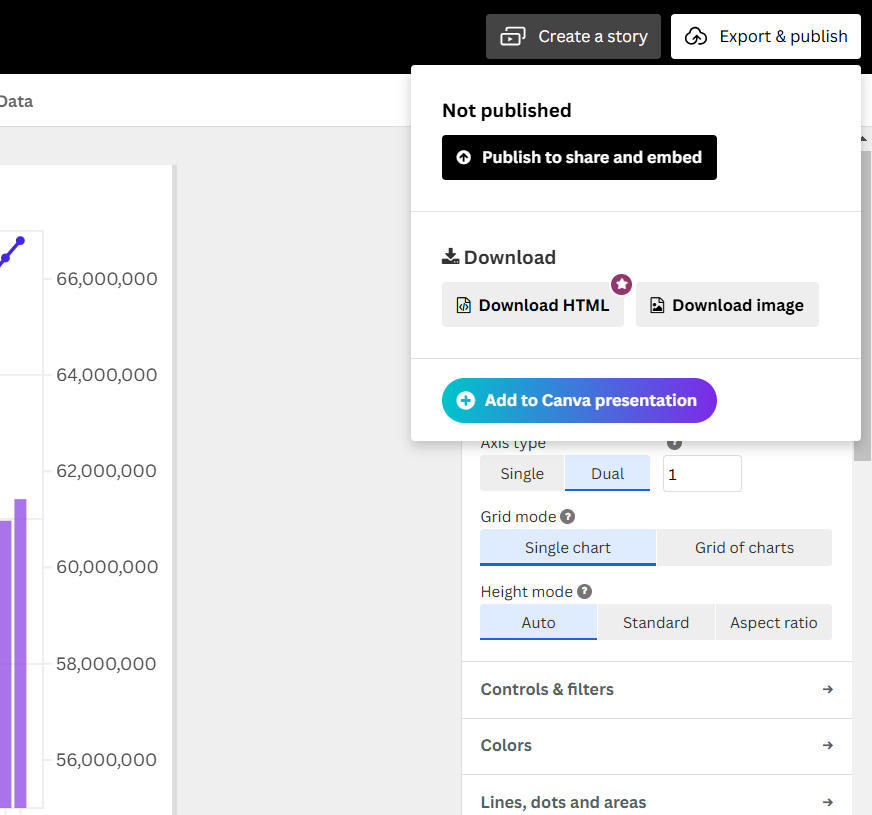
- Click “Publish & Export” in Flourish.
- Copy the embed code to share.
Final Visualization
Why Use a Pie Chart?
- Easy comparison of different smartphone vendors.
- Clearly represents proportions within the total market.
- Helps visualize brand dominance over time.
- Useful for business analysis and market trend tracking.
Now you have an interactive Pie Chart displaying smartphone market share trends!